Genesis Construction
- Service
- Branding
- Location
- Charlotte, NC
Overview
A New Identity for Genesis Construction
Elevating Brand Presence Through Strategic Rebranding
Genesis Construction, a company based in Charlotte, NC, embarked on a strategic rebranding initiative to modernize its identity and strengthen its market presence. The transformation reflects a refined visual language, reinforcing the company's commitment to innovation, strength, and trust within the construction industry.
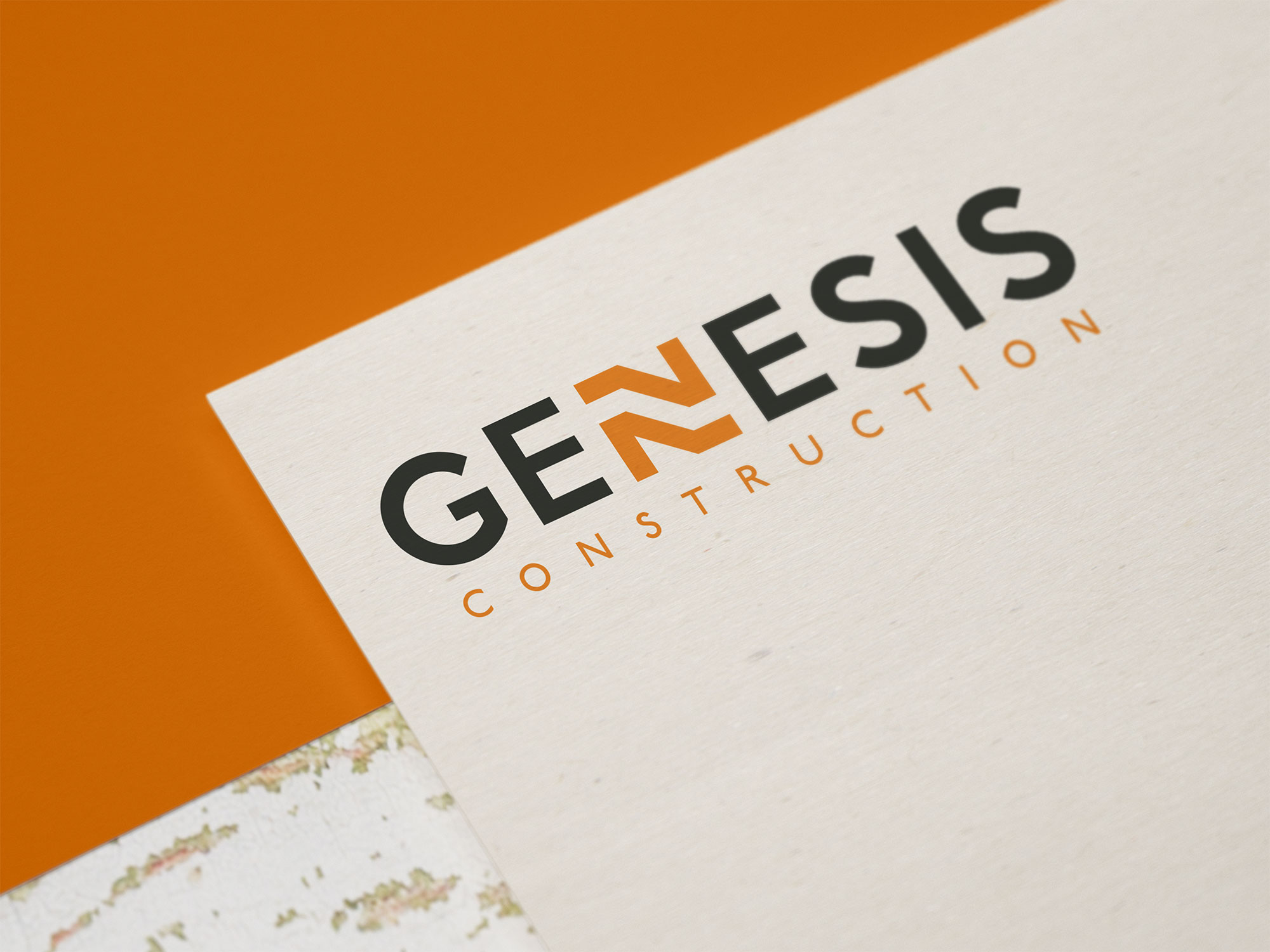
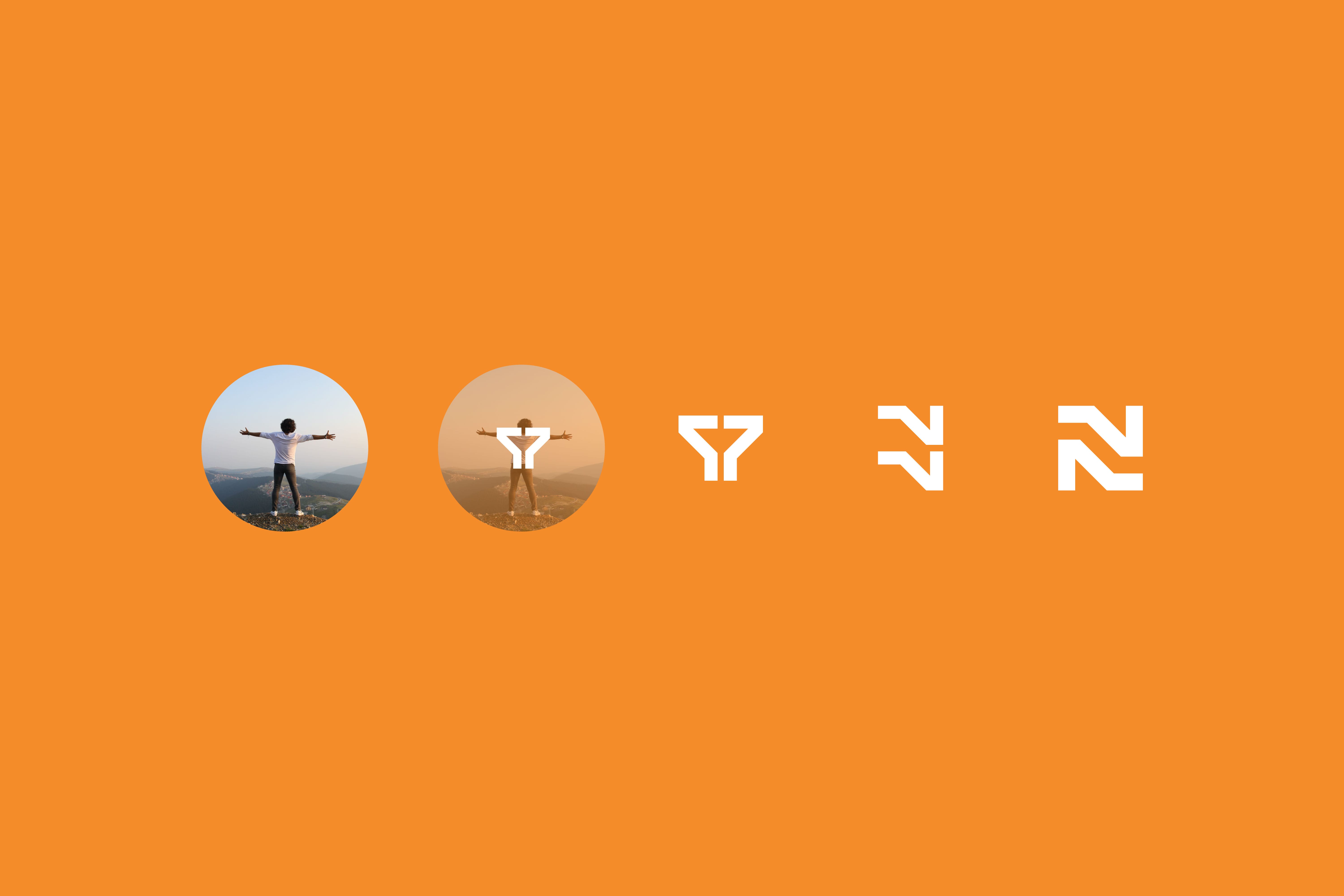
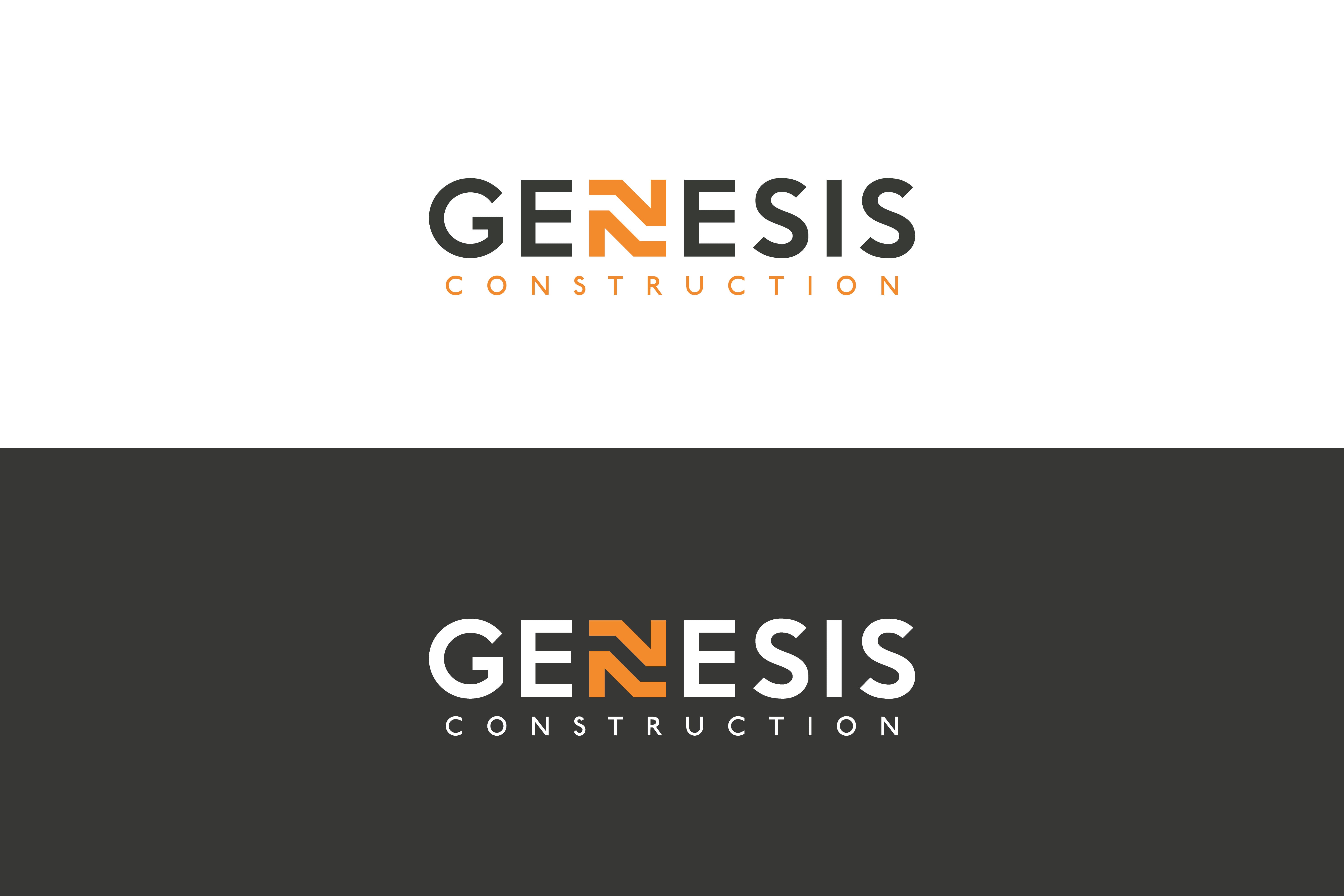
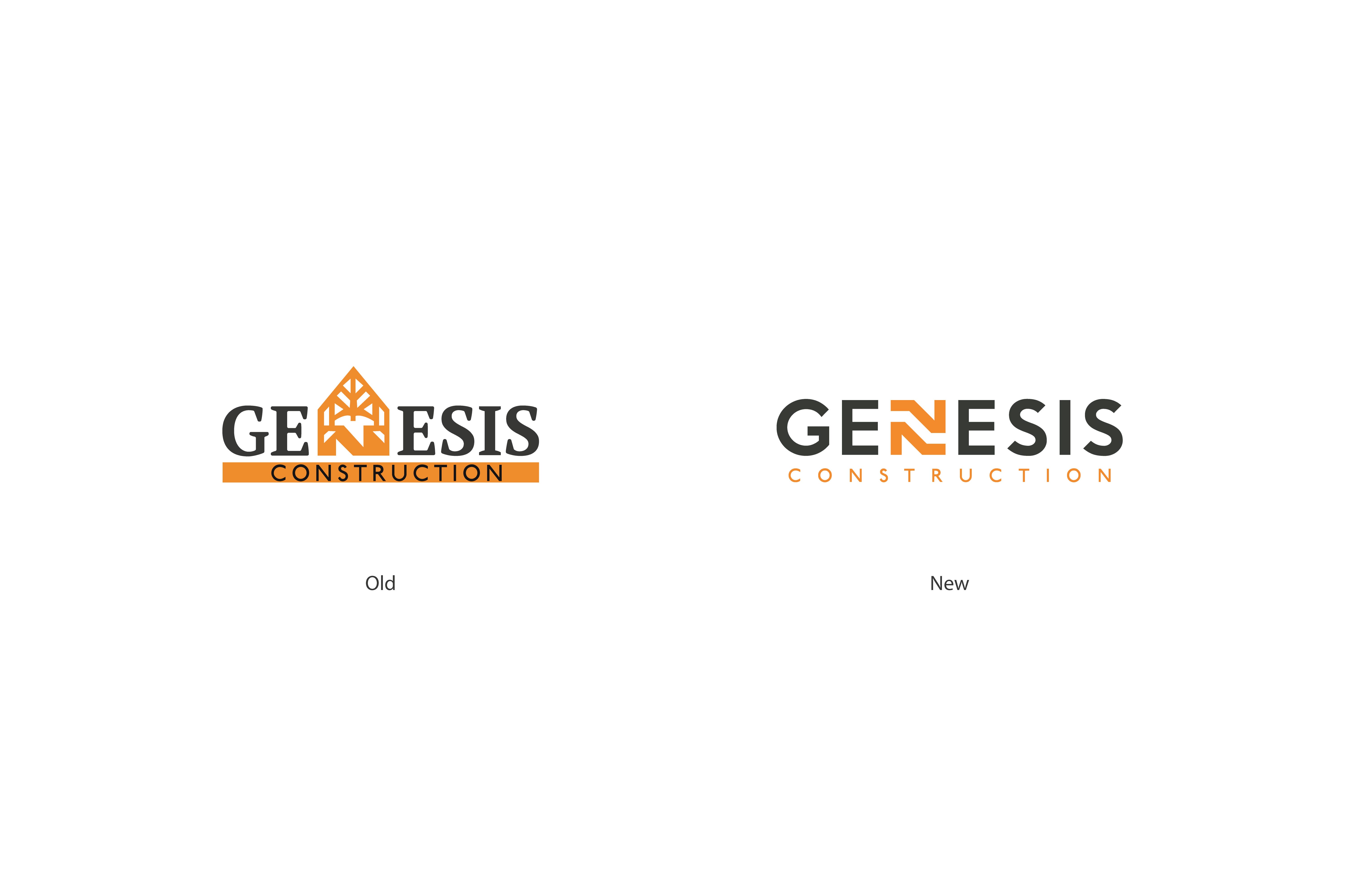
The new brand identity moves away from a traditional, literal representation and adopts a sleek, contemporary design. The reimagined logo replaces the architectural iconography with a bold and dynamic typographic mark, where the letter "N" stands out as a key design element. The structured yet fluid form of the logo conveys resilience and progress, essential qualities in the construction sector. Additionally, a carefully curated color palette of deep charcoal and warm orange enhances brand recognition and professionalism.
Beyond aesthetics, the rebranding aligns with Genesis Construction's core values, building trust, fostering strong relationships, and delivering excellence in every project. The redesigned brand applications, from helmets to printed materials, ensure consistency and visibility, reinforcing the company's leadership in the industry.
- Service
- Branding
- Client
- Construction company
- Role
- Brand strategy, logo and identity design, and web design
Photos
Project Details
Brand DNA Workshop and Vision Strategy for a Construction Company
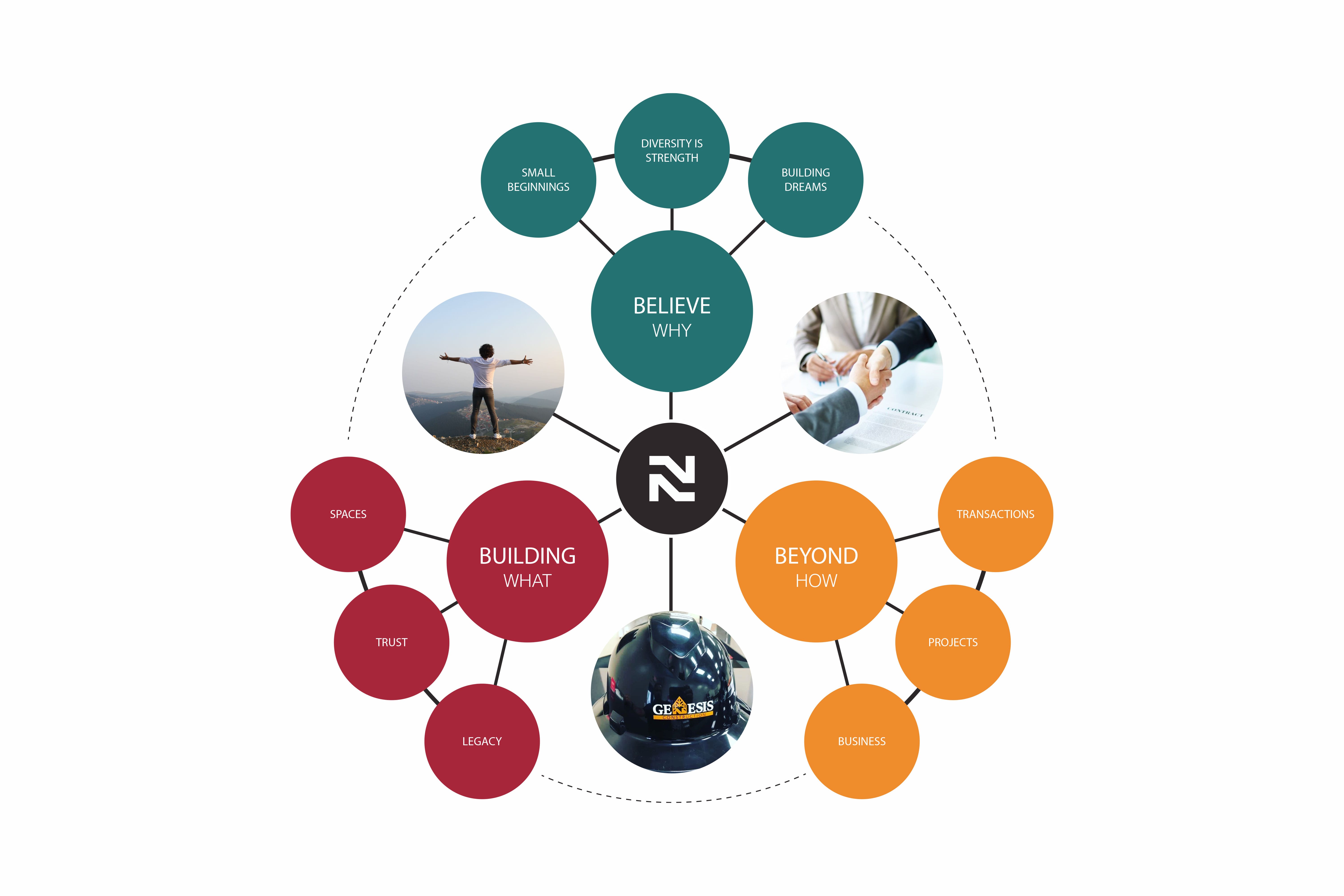
Ossa Studio proposed the Genesis Construction brand work in April 2020 in two phases. The first, Vision and Strategy, centered on a Brand DNA workshop to define the executive vision, the brand and the company's unique differentiators, so the message would be clear. The result is a Brand DNA diagram organized around Believe (why), Beyond (how) and Building (what), with the new N mark at its center.
New Logo and Charcoal and Orange Identity in Charlotte
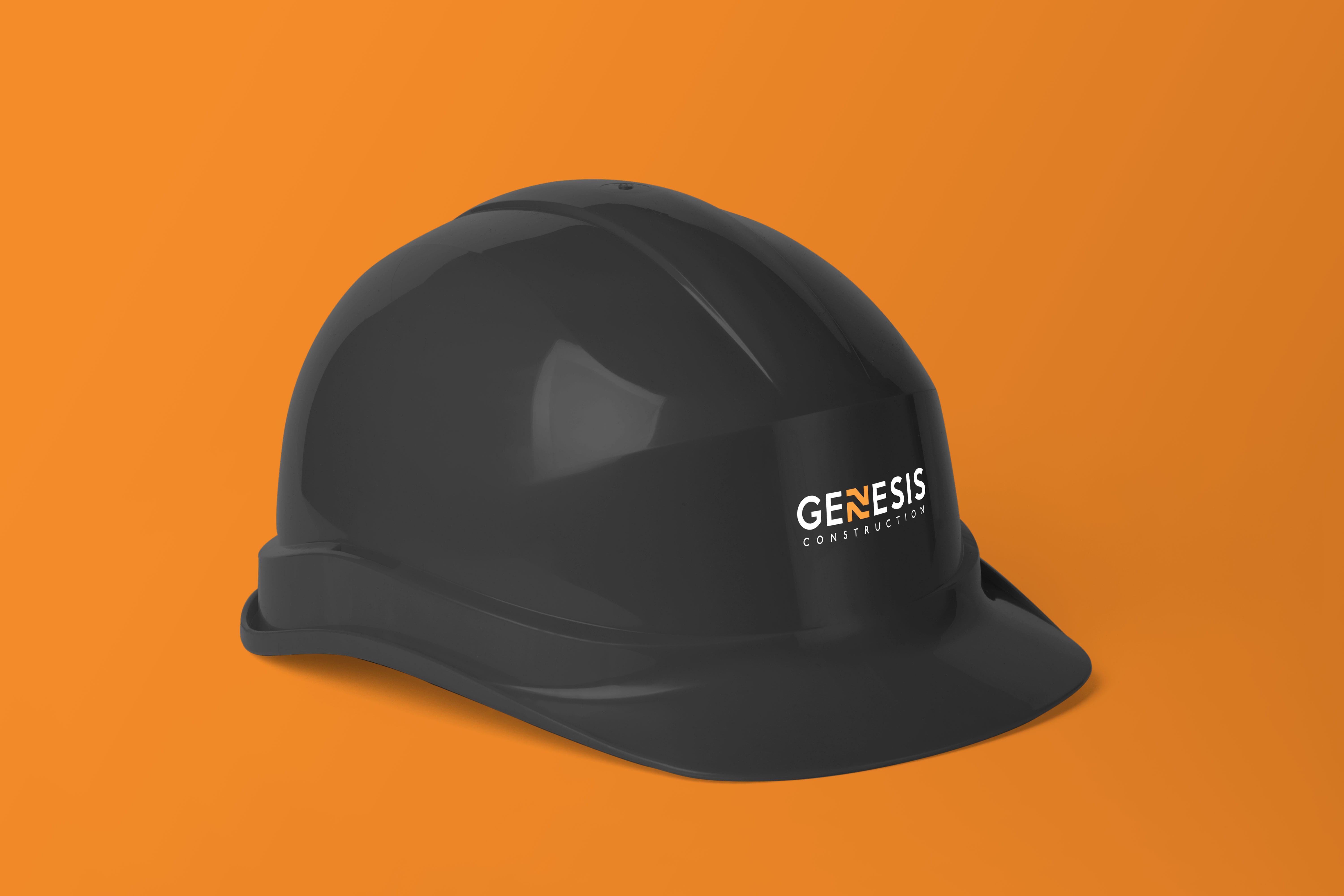
The previous logo paired a serif wordmark with a house-shaped icon on an orange bar. The new identity is a sans-serif wordmark in which the letter N becomes a stacked, angular mark, with the word Construction set in spaced orange capitals beneath. It works in charcoal and orange on light backgrounds and in white and orange on dark ones, and it was applied to a hard hat and a letterhead.
Website, Print Materials and Branding Services in Charlotte
The second phase of the proposal covered graphic identity design, website design, brochure design and a social media strategy, with the website planned in WordPress and execution scheduled for June. An entry sign design is also part of the project files. Learn more about our branding services in Charlotte.
Project Facts
- Industry
- Construction
- Services delivered
- Brand DNA workshop, logo and visual identity, website design
- Deliverables
- Typographic logo with an N mark, charcoal and orange palette, hard hat and letterhead applications, brand DNA diagram